09 Aug How to combine traditional architecture with a contemporary interior
Project Well Court Hall
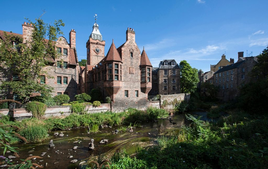
A walk along the leafy paths which run parallel to the Water of Leith takes sightseers through some of Edinburgh’s most delightful locations. One of which is of course the historic Dean Village filled with quirky 19th century architecture and charm. The most striking piece of architecture is Well Court Hall – a red sandstone building with impressive turrets and original paned windows.
Lynsay Bell Architects were selected by LPBZ Ltd to convert the old public hall into residential accommodation. LBA successfully maximised the potential of the building by adding a third en-suite bedroom in the roof space and converting the iconic clock tower into an en-suite bathroom. When we were approached by LBA and LPBZ to present an interior proposal, we were confident that our contemporary aesthetic would work as a harmonious contrast to the traditional surroundings.
How did we manage to combine traditional and contemporary?
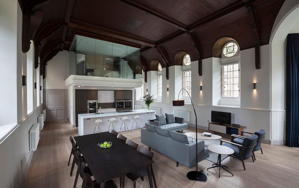
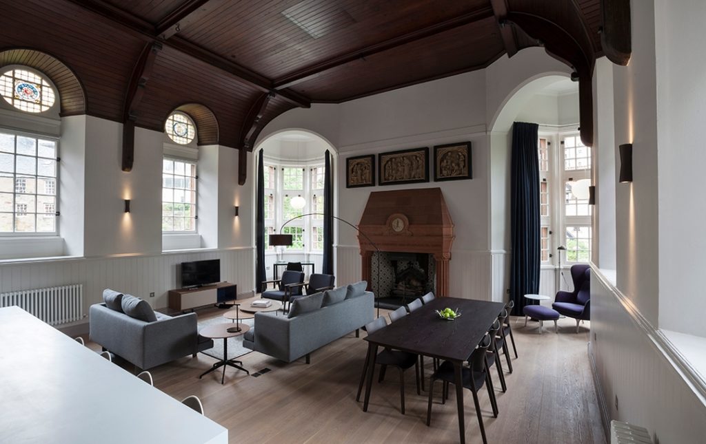
The aim was to create a crisp, contemporary interior with clean lines and defined spaces. We used furniture settings to clearly define living, dining, reading and study spaces in the large open plan room. The living area is made to feel somewhat enclosed with a large three-seat Edward sofa from Bensen flanked by a smaller two-seat sofa and two Zio armchairs from Moooi. The overhead lamp from Ligne Roset provides some more intimate lighting.
Existing architectural features were considered and complemented by using a palette of dark woods for the dining setting, occasional tables, armchair frames and TV unit. A contrasting softness was created with upholstery, rugs and curtains in greys and blues which also added pattern and texture to the space. The turrets seemed like obvious choices for private study and reading spaces to enjoy the beautiful view of the Dean Village and Water of Leith outside.
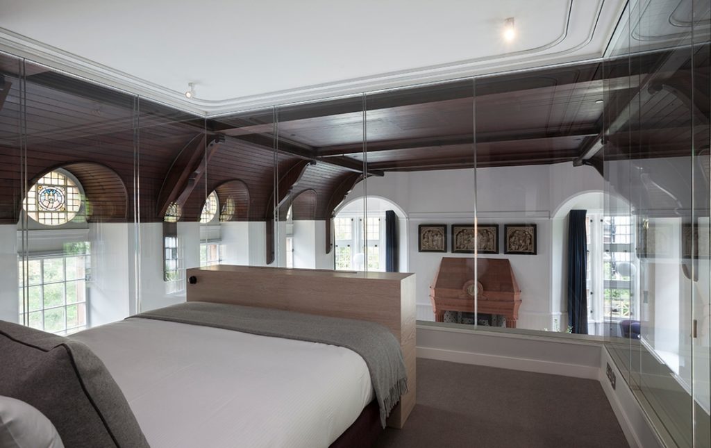
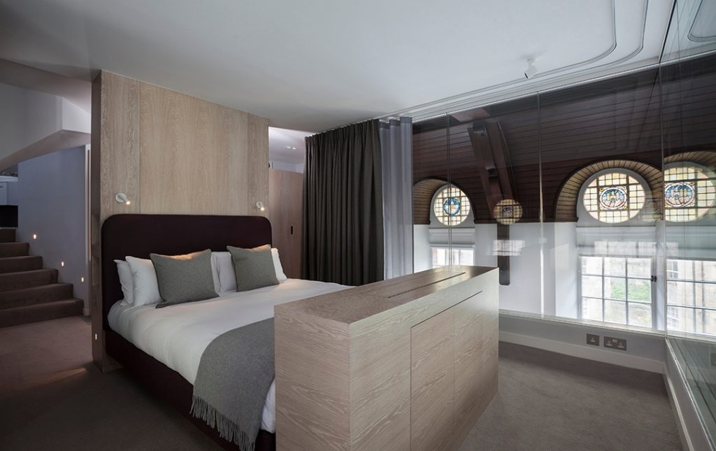
The glass mezzanine bedroom, which was once used as a boardroom, required very little product as the main feature is of course the view. We supplied a king size bed to allow guests to relax fully and enjoy the surroundings; while the double curtain tracks from Silent Gliss provide both privacy and black-out functions.
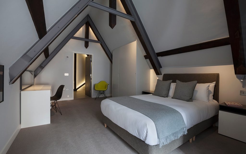
The clean, contemporary aesthetic carries through to the additional bedrooms upstairs with the use of soft greys and upholstered beds. This acts as a contrast to the strong architectural features such as the exposed panels of the vaulted ceiling. We also included iconic Eames side chairs from Vitra, some in bright fabric for a hint of colour.
If you’d like further info on any of the products included in this project then please feel free to contact us on 0131 556 6551 // [email protected]. Project details can also be found on our Houzz page – follow us for more project news!

