27 Oct Spotlight: Roset Revamp
Yes – we are singing the praises of another one of our manufacturers but hey, we wouldn’t supply them if they weren’t praise-worthy. This week it’s Ligne Roset‘s time to shine…
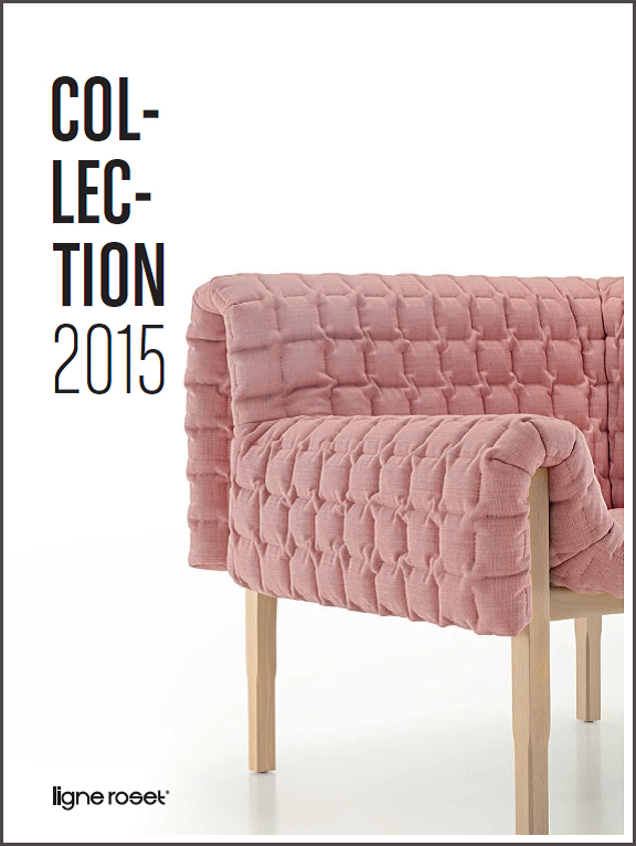
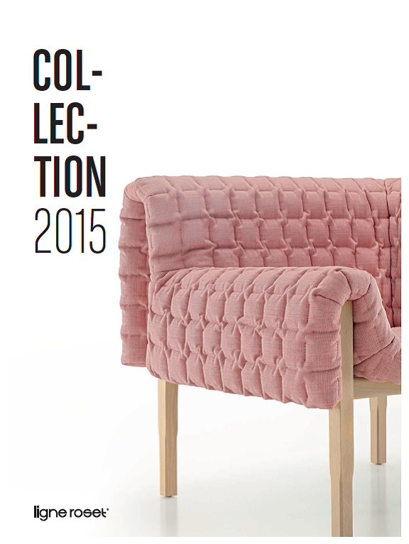
At the beginning of the week we received the new Ligne Roset 2015 catalogue and we were met with a crisp new look.
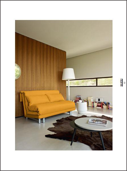
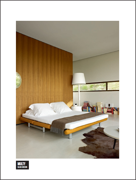
The new and improved layout from the French manufacturer allows for a very easy read with only one feature image per page with the product name simply stated – no frills.
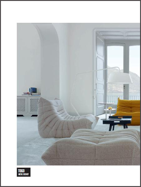
This allows you to really focus on the images of the products as opposed to being distracted by lots of text or busy images. Design publications can often try to be too clever at times (guilty) but this Ligne Roset catalogue demonstrates that less really can be more.
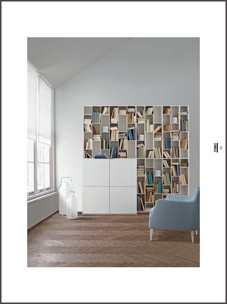
The above image even displays the beautiful ‘Somerset’ lights that we currently have on display in the showroom for the second time. It’s not often we put items on display again as we have so many beautiful products we try and give them all their fair share of display time – but these lights were worthy of a second round!
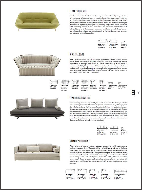
After each product section, every item that has been displayed in the section along with all other items in that product category are listed with the varying options. All in all a very successful catalogue revamp from Roset!
