In Conversation with Interior Designer Wouter: What Defines Good Residential Design?
At Tangram, interior design is always a dialogue - between client and designer, architecture and landscape, colour and light. Since joining the studio in 2020, Wouter has brought a distinct perspective to that conversation, shaped by more than two decades working in residential interior design and a formative career in the Netherlands.
Working from our Edinburgh showroom, he is often the first point of contact for clients. His approach is instinctive yet considered: rooted in personality rather than trend, led by material, texture and depth.
In this conversation, Wouter reflects on his journey into design, the influence of landscape and light on his colour palettes, and why creating an interior that truly reflects the people who live there will always outlast passing trends.
To begin, could you tell us a little about your background and what first drew you to interior design?
My background started in the Netherlands, where I discovered an interior design course. I’ve always been creative and enjoyed being hands-on with things like building and drawing. It just felt like a really natural fit for me - to be creative and to work with people. So I began the course, which included upholstery, furniture making, laying floors and, of course, interior design.
Over the years, I went deeper into residential interior design, which led me into full-time work in 2004. I’ve done that ever since. Initially, I worked for an interior company in the Netherlands. I then moved to Scotland to start a life with my wife, who is from Edinburgh. That was the beginning of me joining Tangram.
How would you describe your current role, and the focus of your work today?
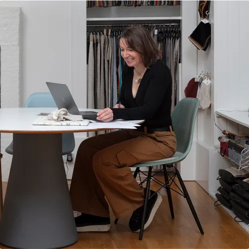
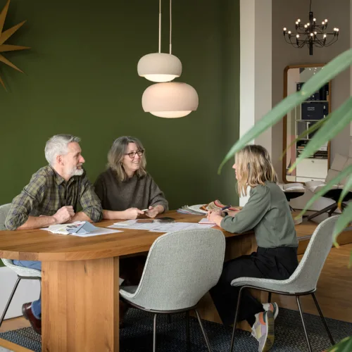
I’ve been a residential interior designer at Tangram since 2020. Alongside Jenny, I’m often the first contact in the showroom, welcoming people in and having initial conversations.
I have always worked in a shop environment, and I like to be almost like a host for people coming in. I’ll sit with clients to understand why they’re here, what they’re looking for and how we can help. From there, the conversation starts.
How long have you been working in the industry, and how has your perspective evolved over that time?
I’ve been working full-time since 2004 - so it will be 22 years by the end of this year.
For me, the client is always the focus. They come in with their own feelings, and they know what they like and don’t like when it comes to interior design - although they might not tell me that straight away. I will ask the questions and work through that with them. I get to know them, and sometimes they get to know themselves a little bit better.
My goal and perspective on residential interior design has always been to create an interior for them - not one that is simply trendy or from the pages of a magazine. With two people in one house, you have to create a really nice mix that shows both of their personalities. Of course I like to take inspiration from trends and new designs, but the goal is to create an interior together with the client. That is what makes it timeless. In saying that I do love working with new things - as an interior designer, you need these – it’s what keeps things interesting.
Are there particular influences — designers, trends, or experiences — that continue to inform your approach?
I’m not a person who just jumps onto a particular interior designer or trend. I don’t really follow things in that way. Of course, there are designers from the past who have created so much in the world. I think of people like Le Corbusier, Charlotte Perriand, and of course Charles and Ray Eames. They really set the design world in those days.
These days, I really love the freshness of Patricia Urquiola - I think she is amazing - and also Jaime Hayon, the Spanish designer. I think they stand out by offering something new. Their designs feel really fresh — they make you think, “That’s really cool. I’ve never seen that before.”
How do you define a ‘balanced’ palette within a home?
I don’t think there’s a straightforward answer, because a balanced palette connects to the client’s personality. You’ve got clients who like to keep their interior really calm, so they go for toned-down colours. And then you’ve got people who are colourful themselves, so you can go bold.
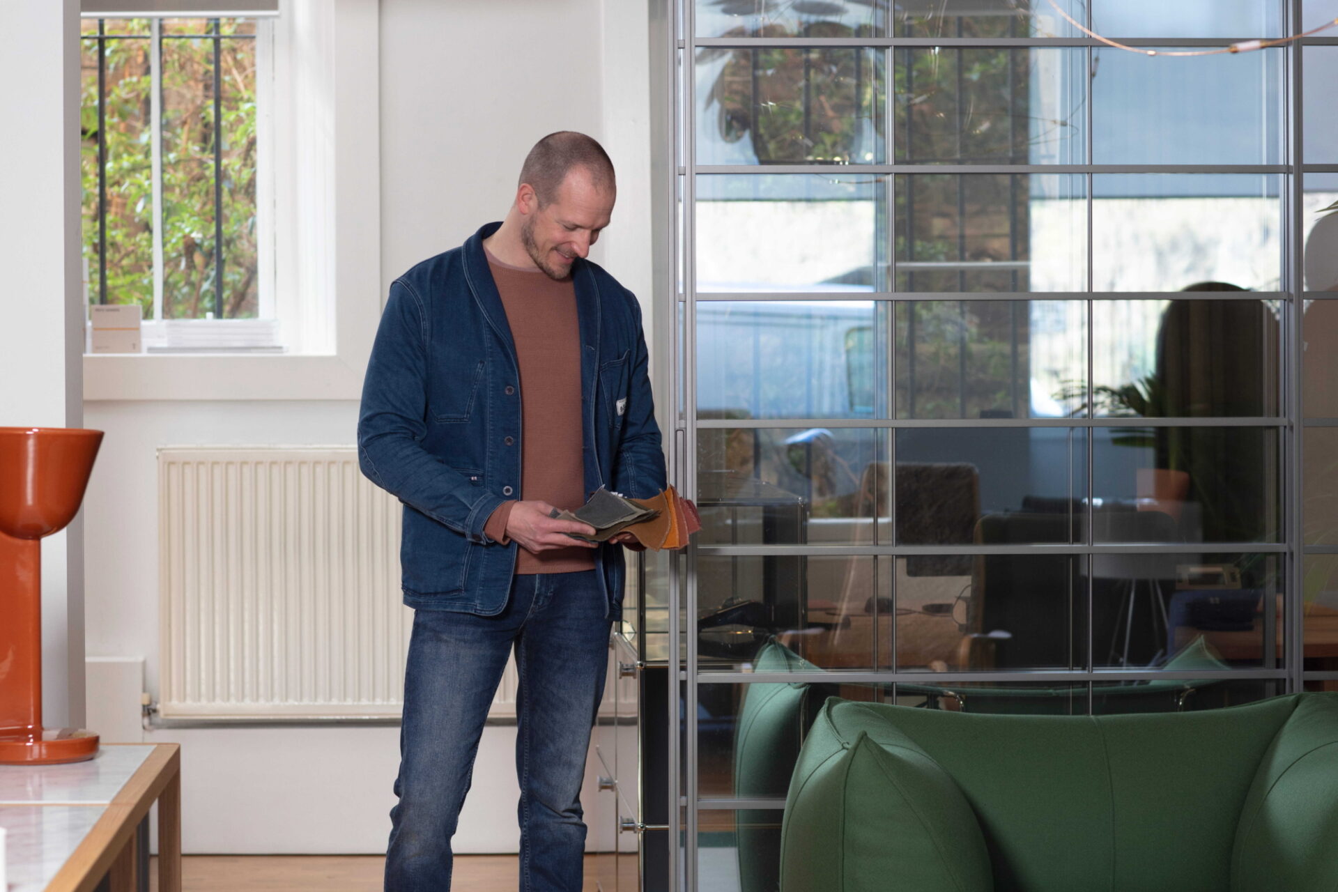
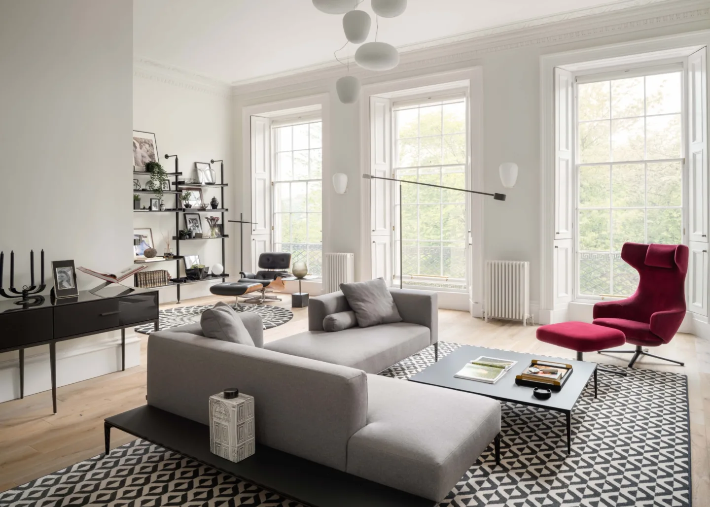
The main thing I’m always looking for in a balanced palette is a really nice mixture of textures - smooth, rough, soft, fluffy. When you play with different textures, you create depth and you create interest. And it’s the same with colour.
You can say, “I want it nice, fresh and toned down.” But if you only use very soft tones, then things can become a blur and disappear in a space. I’m always in favour of using some stronger colours - and that can simply mean playing with light and dark. It creates depth in a room and by creating depth, you create visual space and also interest.
So for me, a balanced palette is a beautiful mix of textures and the right amount of colour used in different tones. It can be three colours, it can be 20 colours - it just needs to be right for the client. And of course, it’s my job to orchestrate that in the right direction.
Do you consider colour in isolation, or always in dialogue with material, texture, and form?
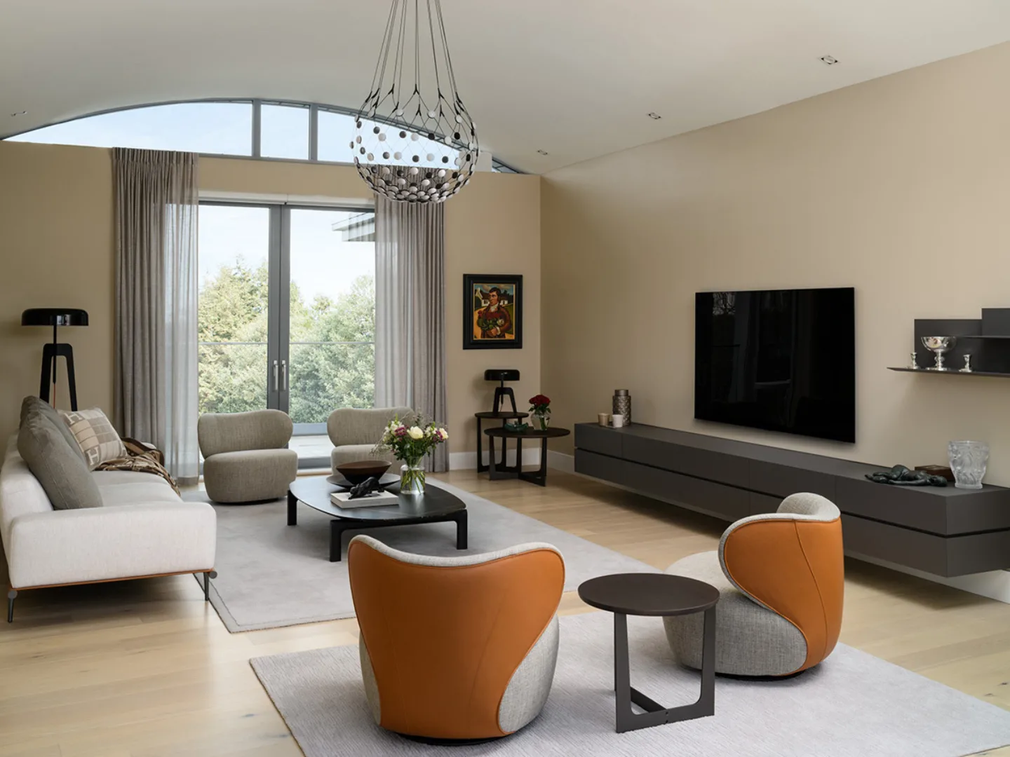
You can have a colour as the main character. For example, you can have one colour in isolation, which you use all over the interior. And you can let that colour come back in all kinds of different tones, and by using that you can kind of create that story throughout your house. It helps connect those spaces together, rather than them feeling like completely separate rooms.
And you can do the same thing with materials and textiles - you can bring that back as well. A lot of architects will do that when they design a house. You will see materials being used throughout. With this you create a really strong ambience.
How does natural and architectural light influence your approach to colour?
As a residential interior designer, you’re much more focused on creating a really nice ambience. So we work more with decorative light. It’s less about how much output there is or how high the CRI is - the real nitty-gritty of lighting - which can be very important when you’re designing a house architecturally and putting in the basic lighting, like spots or LED strips. Then you really need to know exactly what it does.
But when it comes to ambience, it’s about understanding what the light will do in the space. Yes, the output matters - do you need to read with it, work with it, or are you simply creating a really nice glow somewhere in a corner? For me, light is important in a house to take out any dark corners, because that can take away the nice feeling in a space. It can be a really beautiful small light, a lovely object - but it needs to do something.
We’re now working with Davide Groppi. Their lighting has a very considered output. It's neat, very architectural. In a clean architectural house, it’s the perfect match, because it’s so refined you almost want it to disappear into the architecture.
At the same time, in a warm, more decorative house, you can still use it because it almost disappears into the space, while giving you that really nice spotlight to highlight artwork or a beautiful wash of light over a wall or along a hallway.
So light is incredibly important. It’s also a maze for clients. There’s just so much choice, and from a screen you don’t really know what it does. That’s where guidance matters: understanding what a light will create in a room, and how it will ultimately influence the colour and the feeling of the space.
Is there a recent project where a particular colour decision meaningfully transformed the character of a space?
Every client is so different. Compared with my background in the Netherlands, in Scotland people are, in general, more toned down when it comes to contemporary interiors, especially in their colour choices.
At Tangram they call me the king of colour, because I’m always drawn to it. I love to implement colour if possible. It can be incredible.
Colour can feel scary. But put it on your walls, choose a fantastic wallpaper, and it completely transforms a space. And if in a few years you feel differently, you can change it. Done correctly, it’s still timeless.
If you look at the old houses we have here in Edinburgh, the beautiful wallpapers and colours used over centuries show exactly what colour can do. I think it proves how powerful it can be. It’s just that on the contemporary side, people don’t always see that it’s still possible.
Has there been a project where the building itself has influenced the colour palette?
In the last few years, I’ve been involved in interior design projects on the Isle of Skye, as well as Harris and Lewis.
In these very remote locations, the surroundings are always incredibly important. People want to connect to the views and to where they are. You completely understand that — you just want to sit in a really comfortable chair with a warm cup of tea or a nice glass of wine and look outside. And when you do, you see all those beautiful natural colours. That naturally pushes the palette to reflect the landscape and create a strong connection to the outdoors.
If you’re beginning a new project or simply looking for the right piece to complete a space, we’d be delighted to help. You can also explore more about what we do - across residential and commercial interior design projects - here.
0131 556 6551 / [email protected]